Altering Button Properties
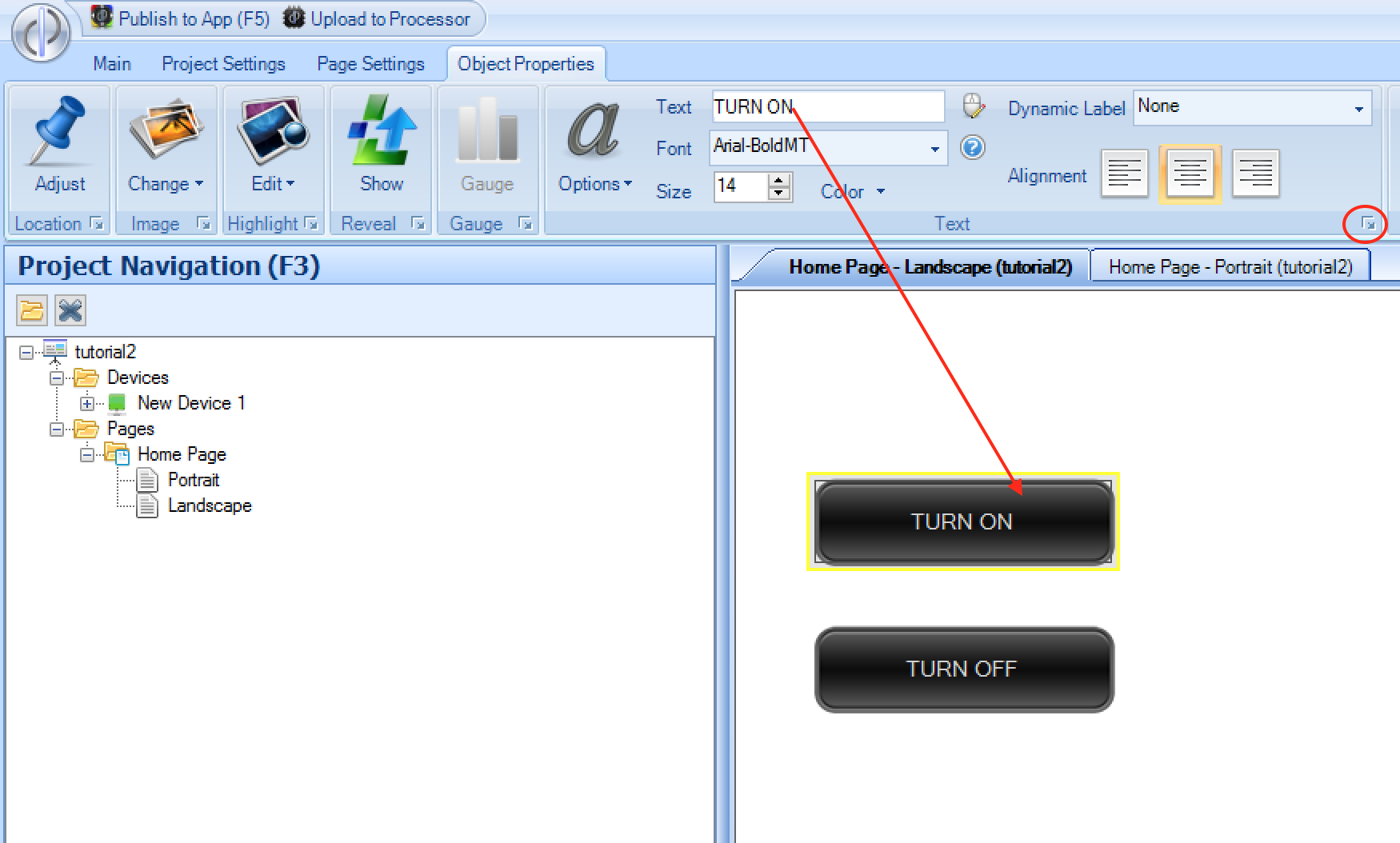
Once you have added or clicked on a button, the dynamic top menu will change to the Object Properties menu, where you can alter the button properties. For example, you may wish to add some text to the button,
which you can do by expanding the Text menu option:
You can also change the image associated with the button by using the Image menu, which includes options for resizing & displaying the image:
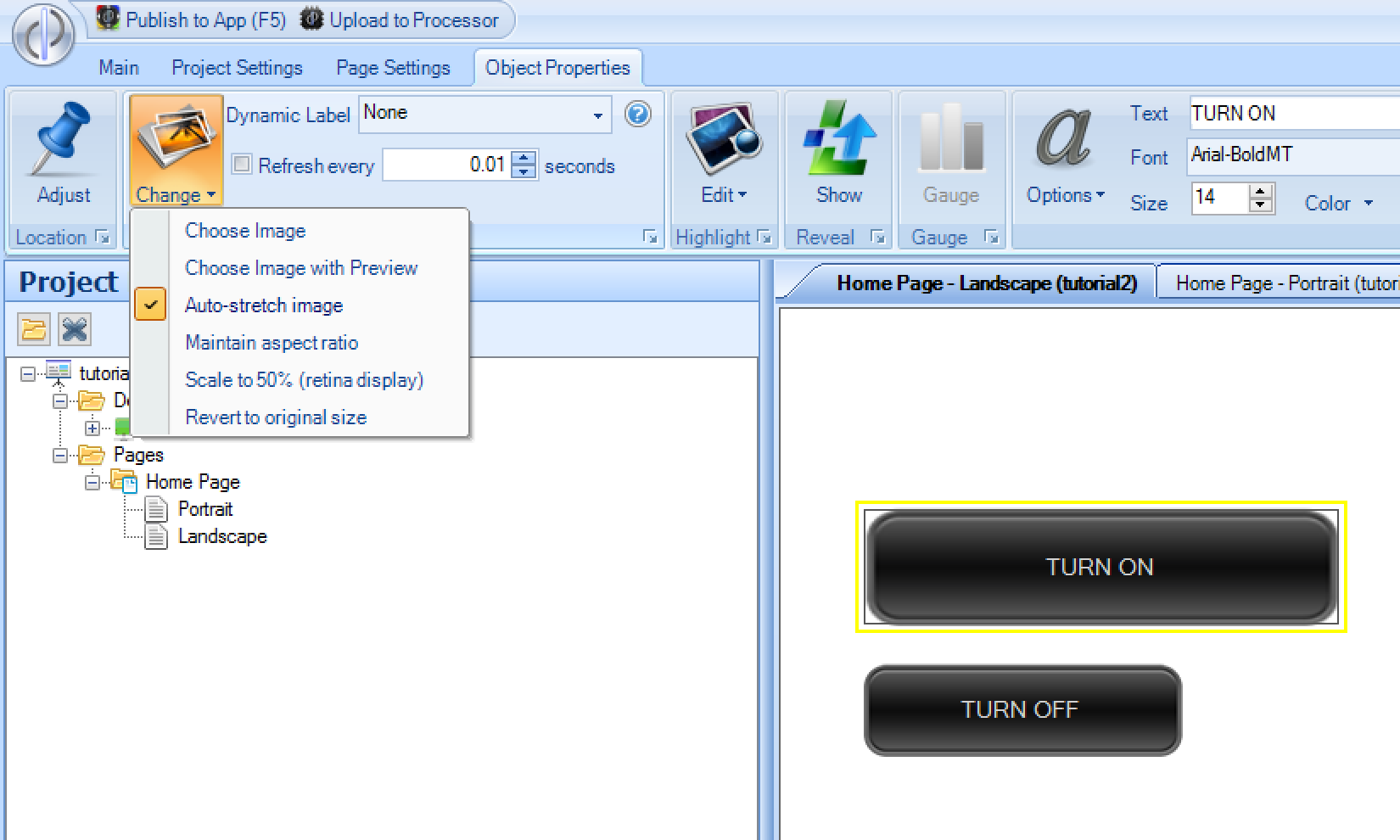
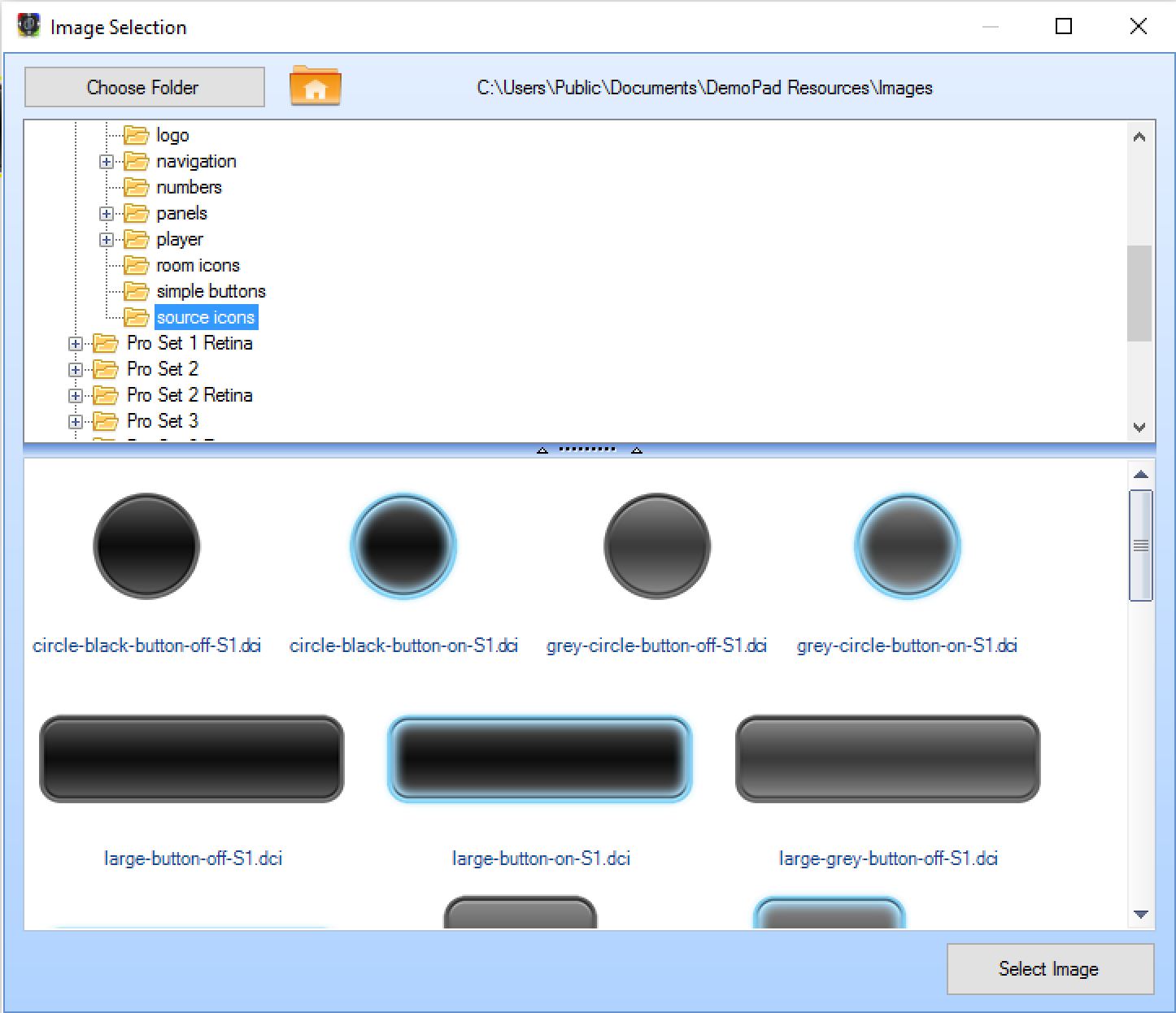
Note, because some of the graphics distributed with the DemoPad solution are encrypted, the Choose Image option which shows a standard Windows dialog will not be able to show a preview of the image files,
so there is also a Choose Image with Preview option which allows you to choose a directory & see all the images within it, including the encrypted DemoPad images:
Resizing Buttons
As shown above, the size of a button may be altered. There are 2 ways to do this, either by clicking and dragging the bottom right hand corner of the button, or by using the Button size menu for more accurate sizing:
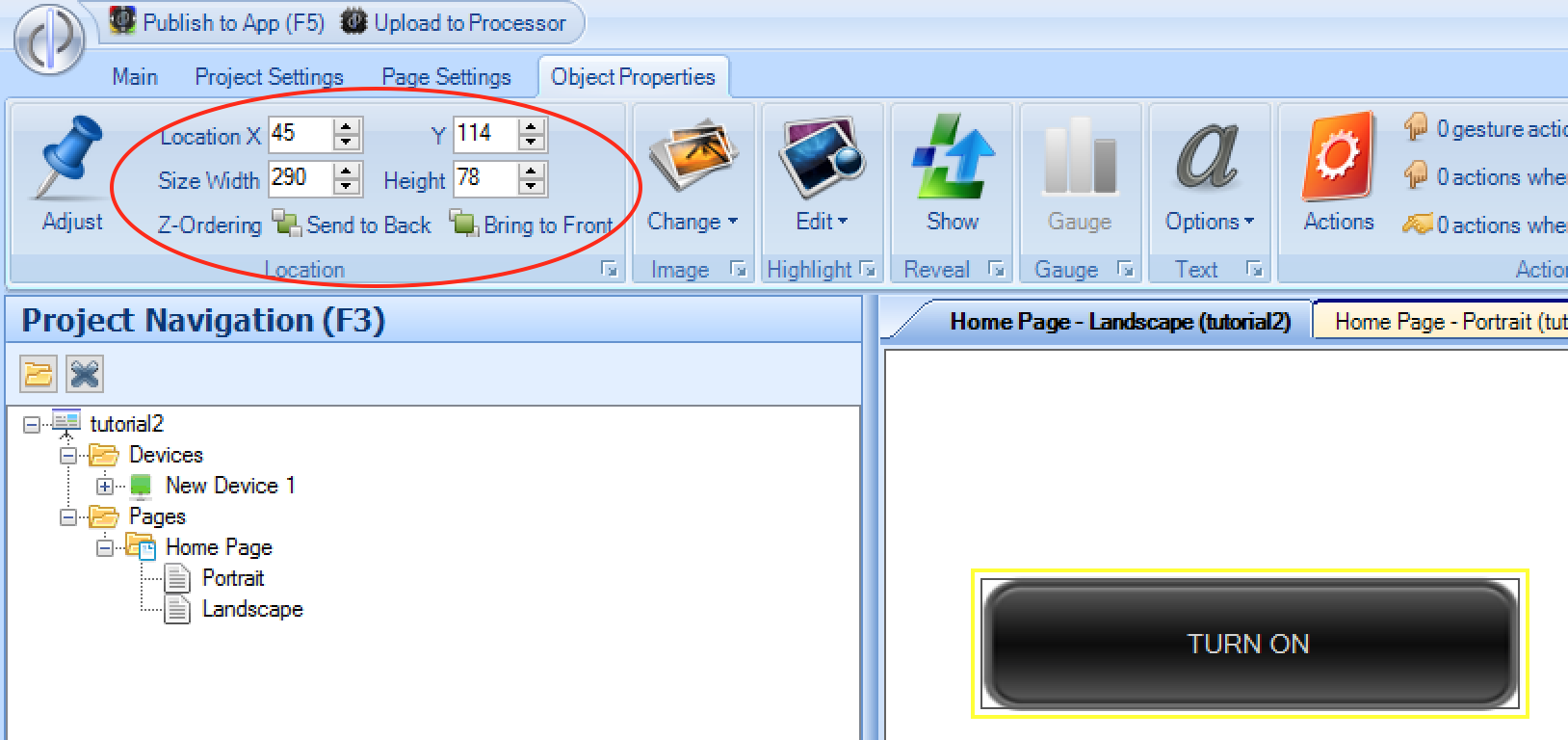
You can revert to the original size of a button using the Image menu option Revert to original size above.
Button Highlighting
When you add a normal button to the UI, it has a single image associated with it. It is possible however, to define a secondary highlight image which shows the button in a different state under certain conditions.
You can choose the alternate highlighted image using the Highlight menu option and selecting the highlight image:
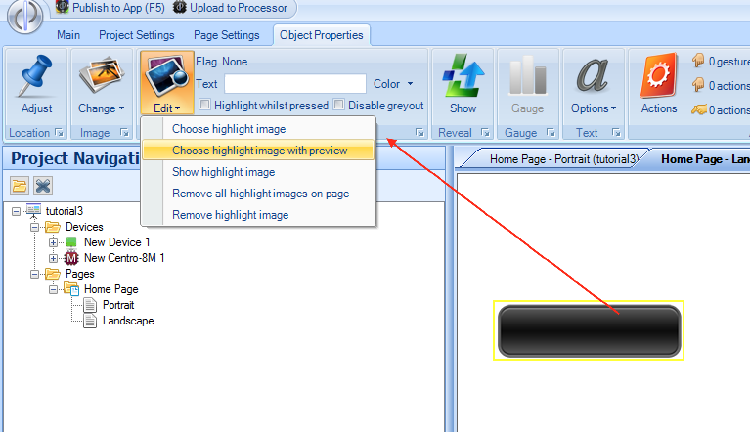
Any alternate image may be used (and if a different size, will be scaled to the size of the original button), however it is usually appropriate to use a similar image - for example all our standard images come with a 'blue glow' equivalent image which is suitable for highlighting.
It is also possible to enter some text in the highlight menu which is displayed when the button is in its highlighted state.
There are 3 ways to initiate the highlight state for a button:
Highlight whilst pressed - if this option is selected in the highlight menu, the button which show its highlight state (image / text) whilst the user has their finger on the button, and will revert to the normal state when the finger is released.
Using a Flag - Buttons may remain highlighted whilst a flag is in the
ONstate - see FlagsIf linked to 3rd party drivers - Certain 3rd party drivers automatically link the highlight state to the driver, so highlighting is performed automatically (for example showing the current light scene of a lighting system)