User Interface Basics
The DemoPad user interface for a given project is entirely customisable. It is not specifically based on zones or activities, but instead allows full flexibility of UI design to suit the specific requirements of the project.
The user interface consists of one or more pages, which represents the screen of the device being used (iOS, Android or Browser). When a project is first created, a default page called Home Page
is created automatically, and is the first page which is displayed to the end user.
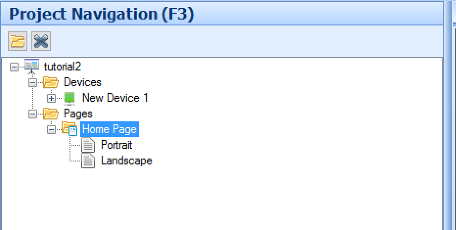
Pages appear in the project navigation tree view, and consist of a portrait and landscape version of the page:

To access the page menu, click on the portrait or landscape icon in the tree view. Note there is nothing in the software which requires that objects placed on the landscape page must be on the portrait page and vice versa - indeed
some projects only use a single orientation, and lock out the other. If you do wish to place the same UI on both orientations, you should use the Mirror copy option to make a linked copy on the alternate orientation.
Each page can have a background color or image, and one or more of the following Page Objects:

Buttons - Button are the most common page object type. They are pressable images which can initiate actions, for example sending a command when the button is pressed.
Images - Images are static image files which appear on the UI, but cannot be pressed - they are there purely for visual effect.
Text - You can insert static (or dynamic) text onto the UI using a Text object.
Gauge - A gauge is a 0-100% slider, typically used to control or show feedback for volume, lighting levels etc
Web View - A Web view is a small web browser within the app which can display a web page or browsable content.
iTunes Module - (iOS app only) connects to a computer running iTunes on the same network & allows media to be browsed and played, via airplay to any airplay destination.
Colour Wheel - This shows a circular color picker, typically used to choose an RGB color in a lighting system
Building Block - This is a pre-saved group of other page objects, which speeds up project creation
Smart Block - This is similar to a building block, but contains all the commands and variable associations.
Sub Page - This is a smaller page, which can contain any other page objects, and which can be placed on a normal page.